Brief
Design and build an expanded version of iSimulate's ALSi medical training application with a new interface for the REALITi product rebrand.
Goals
Role
UI Designer — responsible for researching and designing the new primary controls as well as designing the new control panel.
The Problem
An outdated interface with difficult controls
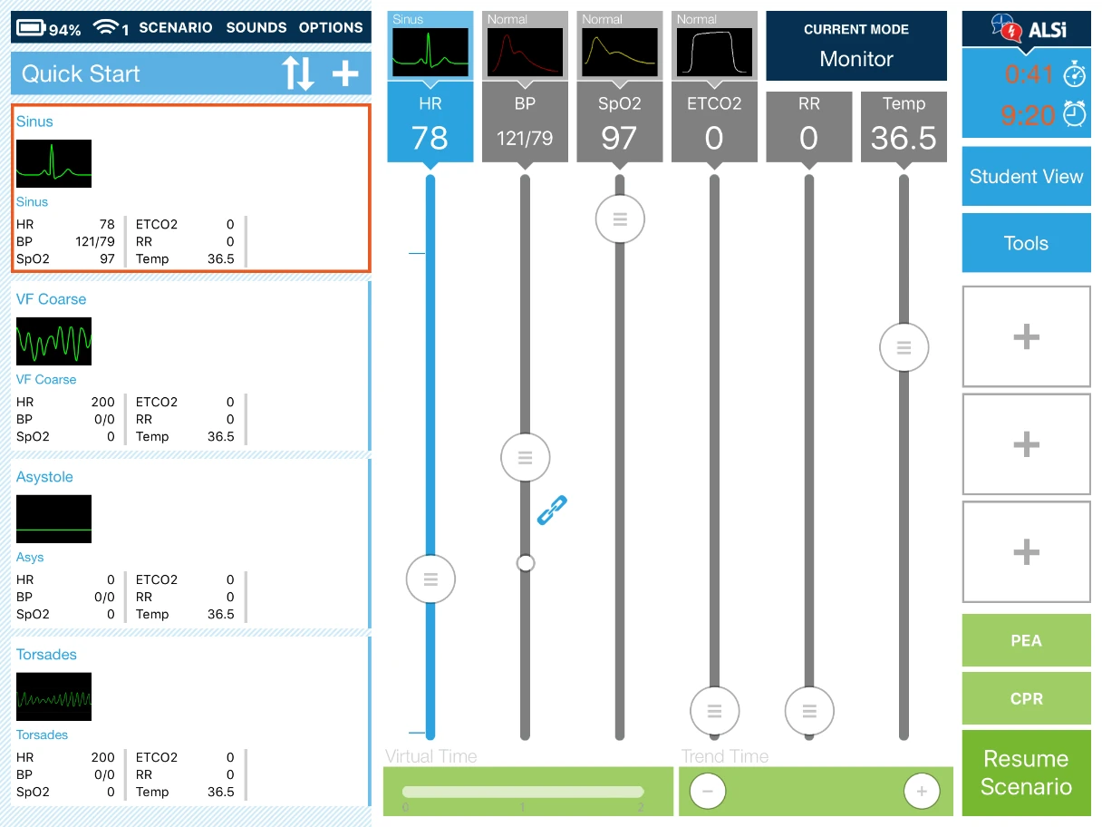
iSimulate provides smart simulation solutions for clinical medical training.Their first app, ALSi let trainers control simulated vital signs on an iPad with 6 primary controls for Heart Rate, Blood Pressure, Oxygen Saturation, End-tidal Carbon Dioxide, Respiratory Rate and Temperature. The control system used vertical range sliders to adjust vital sign values. Each range slider had fixed values relevant to that particular vital sign. Additionally there was space to add three secondary controls, denoted by the three + icons on the right side of the screen.
These vital signals would show up on a second iPad with a simulated Vitals Monitor which students would use to learn to diagnose various conditions and practice medical scenarios. Trainers have the ability to save vital signals into pre-configured events that can make multiple changes at once. These events could be used to preconfigure a series of changes to keep scenarios consistent on each run through of the scenario.
While the app was popular with trainers for its simplicity there were a number of issues, mainly that the controls were far too touchy for making small changes. For example, the heart rate slider was ranged from 0-300. This lead to difficulties with increasing heart rate in small increments at a time. On top of this, the Blood Pressure slider had two controls on the one track for systolic and diastolic adjustment, which caused issues with touch target proximity when values were set closely.
Additionally the design of the app was limiting the ability to add new features that would make the app a more full featured training tool. Attempts had been made to try and fit new features in to the existing design but had proven to be difficult. The client wanted to go back to the drawing board with the layout of the app to allow for future growth and expandability.
The Solution
A new control paradigm
The biggest hurdle in iSimulate's new app, REALITi, was that the controls had to be considerably more compact while retaining all the functionality from ALSi and adding new features. As the primary UI designer on the project I spent a lot of time interviewing I was tasked with researching and designing the new controls for the app. The decisions made for the new control system would have a flow-on effect for the rest of the Control Panel's features.
The initial phase of the project involved a number of interview calls with the head doctor at iSimulate in order to get a better understanding of what the controls are for and how they are used by trainers. These conversations led to two main decisions. First, not all main controls from ALSi needed to be treated as equal in terms of hierarchy and second, the controls needed to have the ability to expand into an advanced mode.
The first of these decisions resulted in us choosing to remove temperature as a main control and demote it to a secondary control as it was the least used control. The next control that we modified was the Respiratory Rate control. We combined this control with ECO2 using a simple toggle. The reason for this combination is due to Respiratory Rate requiring an option for choosing a wave form, so it had to stay as a primary control.
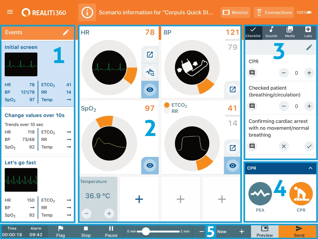
The control we ended up with was heavily inspired by the click wheel on classic iPods. The speed at which the user provided input would directly correlate to how fast the changes made. Each control box had additional controls for showing and hiding the controls on the Vitals Monitor iPad, while Heart Rate, Blood Pressure and ECTO2/Respiratory Rate controls got full screen advanced control modes with dedicated controls specific to that vital. This satisfied the criteria for the second decision from the discovery phase.
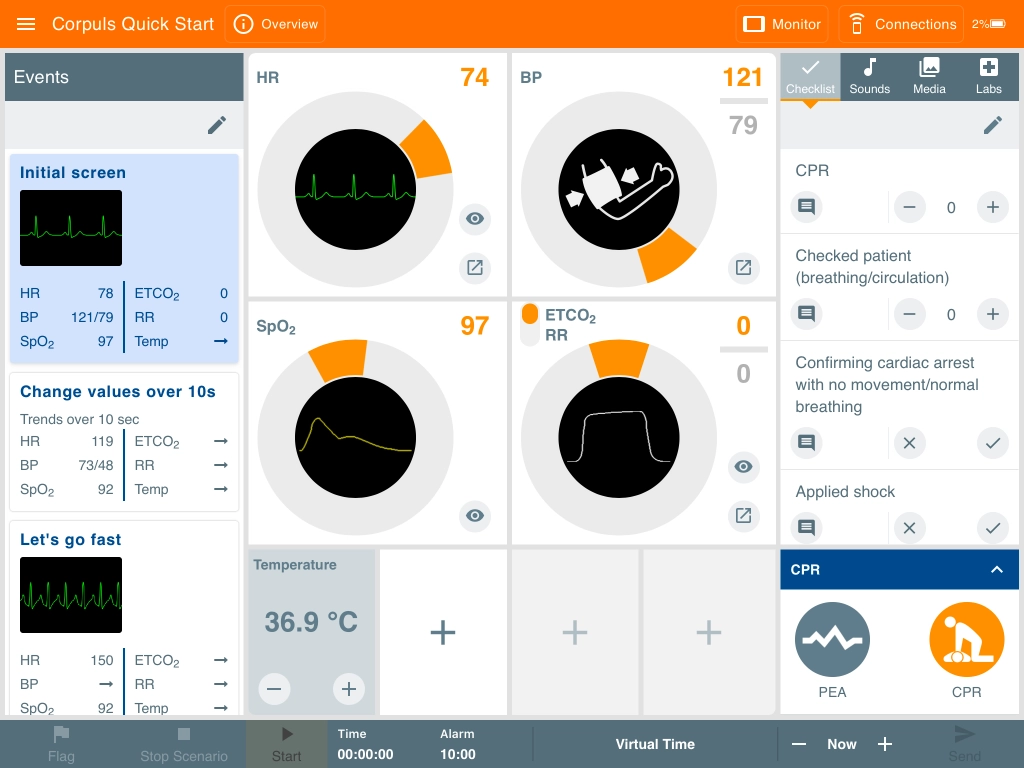
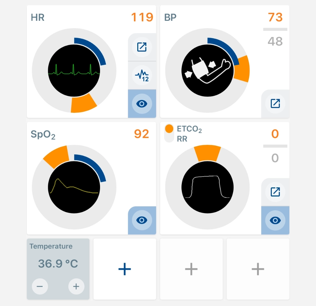
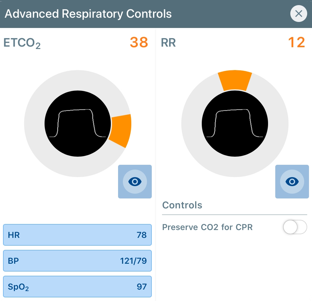
The design of the new circular controls freed up a considerable amount of horizontal space due the nature of them being able to be stacked into a concise grid. This made way for the new sidebar with the checkbox, media libraries and the CPR control panel.
The Events panel was narrowed significantly from the old ALSi design, where it took up just over 33% of the screen real estate. The events were redesigned with a 2 column grid for wave form changes as opposed to ALSi which had waveforms displayed horizontally. The added benefit of this is that wave forms were larger visually on screen for quicker recognition at a glance.
The first major new feature added was the Scenario Checklist. This was a feature that had been heavily requested for ALSi. The feature allows trainers to set a list of criteria to measure against and to choose between either a simple yes/no checkbox or a rated number scale item. Checklist items can also be marked as Critical criteria for the completion of the scenario.
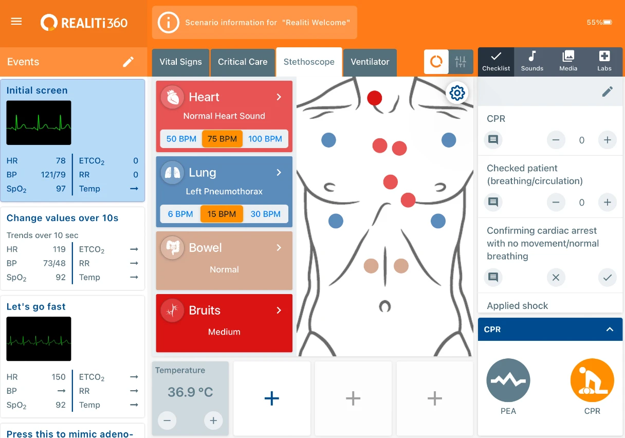
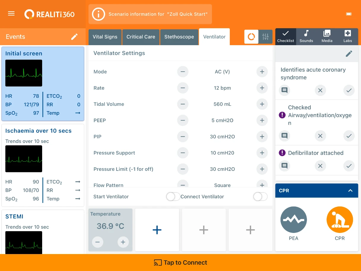
Over the last 6 years there have been many new features added to the Control Panel and the design has stood up to all of the changes without the requirement for any major reworking. There have been new controls added for Critical Care, a virtual stethoscope and ventilator.
Overall, the redesign of ALSi to REALITi was a resounding success, earning iSimulate a Telstra Small Business Award in 2018 and eventual acquisition by 3B Scientific to improve the company's global presence.
